UX Design project enhancing visual, responsiveness and customer brand identification.
The Problem
Customers of Theisen’s struggle to easily navigate and engage with our current email format, resulting in a frustrating and confusing experience that hinders their ability to find relevant information and connect with the brand.
The Goal
Deliver visually captivating and user-friendly emails that empower customers, providing a seamless experience to effortlessly explore our offerings, forge connections with the brand, and enjoy personalized benefits.
Role
User research, wireframing, prototyping, usability testing, iteration, and the creation of a final high-fidelity prototype.
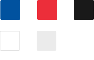
Color Palette

Typography

Iconography
Problems Statements
“I find it challenging to navigate Theisen’s emails and find the specific products and deals that I need to keep my farm running.”
John, 42 years old, is a farmer who needs to find the best deals and farm supplies because he wants to save money and be more focused on cultivating his crops and tending to his livestock.
“The overwhelming and disorganized content in the emails makes really difficult for me to find the right products.”
Sarah is a busy working mom who needs to manage her tasks more efficiently because she wants to spend more time creating and cultivating a thriving garden oasis.
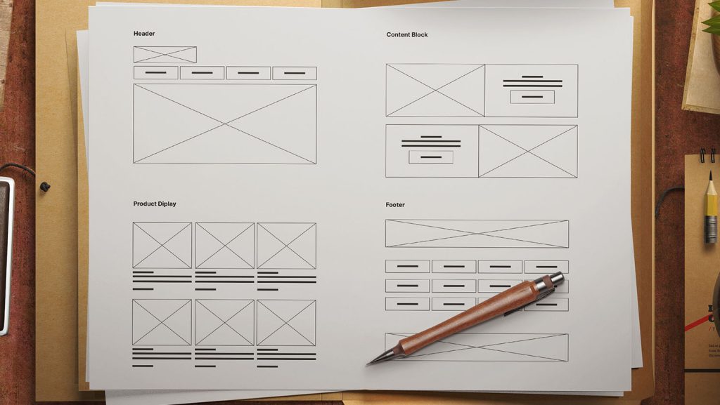
Wireframes

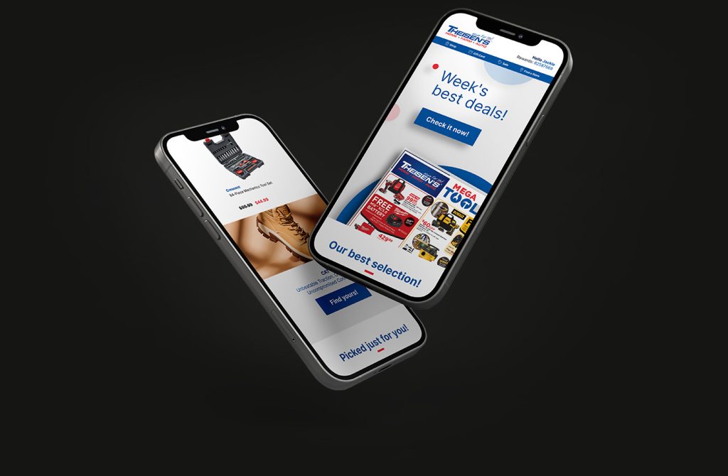
Mockups and High-fidelity Prototype
Visual aesthetics and responsiveness

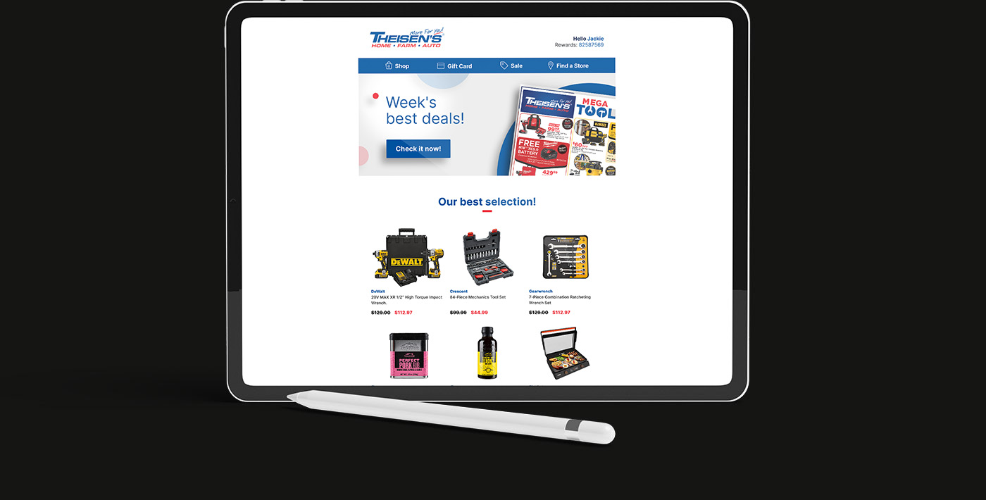
Mockups
Desktop version

Accessibility
Considerations
1. Each page uses alt text to allow a screen reader to read the content.
2. The design is making appropriate use of headings to improve the content structure and readability.
3. The design is providing descriptive link text to enhance clarity and ease of use.
4. The content is using clear and concise language, avoiding complex terminology.
5. The email will adapt to different screen sizes.
